Ink
#1A1A1A
--color-ink
Primary type, masthead, footer, all editorial copy.
Brand guide
Editorial-first, considered, restrained. This page documents the visual system for anyone designing, advertising or producing content with us.
01
The wordmark is set in Red Hat Display Black with tightened tracking. It is the only mark we use in long form. Use the currentColor SVG so it adapts to its context.
02
Seven core values. Use ink and bg for nearly everything; reach for accent only when calling attention to category labels, links and primary actions. Light mode is canonical; dark mode is a derived inversion.
#1A1A1A
--color-ink
Primary type, masthead, footer, all editorial copy.
#4A4A47
--color-ink-soft
Body text where contrast against ink is needed.
#8A8A85
--color-ink-mute
Eyebrows, meta, captions, dates.
#C8923A
--color-accent
Category labels, links, primary CTA hover, hairline accents. Use sparingly.
#FFFFFF
--color-bg
Page background. Pure white for maximum text contrast.
#F7F4EE
--color-bg-sunken
Cards, ad zones, form panels, newsletter strip. Subtle warm tint for hierarchy.
#E8E2D6
--color-line
Hairlines, dividers, card borders.
03
Two typefaces, both from Google Fonts, both with font-display: swap. Red Hat Display is reserved for headlines, the masthead and eyebrows. DM Sans handles everything else. Body copy uses a 1.7 line-height for editorial comfort.
04
How Courtelier sounds, in nine words and a sentence each.
Padel is exciting; we don't need to perform that excitement. The reader is intelligent and returns repeatedly. We earn their attention by being worth coming back to.
"Bullpadel Hack 03 Junior" beats "an entry-level racquet". A word count beats "lengthy". A name beats "a top player". Specificity is what gives the writing authority.
We do not write copy that reads like marketing. Even on the advertise page. Our voice is editorial first; commerce sits in clearly-marked rooms within it.
UK English (organisation, colour, recognise). Single quotation marks for dialogue. Em dashes with hair spaces. Numbers under ten in words; over ten in figures.
05
Hero imagery is photojournalistic. Natural light where possible, the action mid-motion, never staged. Avoid stock-feel imagery (clean backgrounds, frozen mid-air poses with motion-blur added in post). When commissioning, ask for the shot before or after the obvious money frame.
06
An 8-point base scale. Every margin, padding and gap in the system is one of these values, no exceptions.
--s-1
4px · 0.25rem
--s-2
8px · 0.5rem
--s-3
12px · 0.75rem
--s-4
16px · 1rem
--s-5
24px · 1.5rem
--s-6
32px · 2rem
--s-7
48px · 3rem
--s-8
64px · 4rem
--s-9
96px · 6rem
07
Logo files and a colour palette for design tools. For larger asset packs (display ads, sponsored content templates), get in touch.
Outlined paths, currentColor fill, scales to any size. Use as the primary logo.
"C" monogram on charcoal with amber accent. For browser tabs and small contexts.
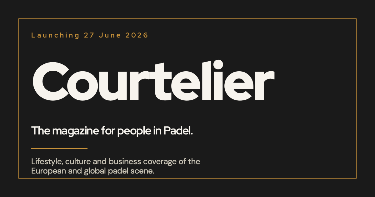
1200×630 social-share preview. Includes wordmark, tagline and brand colour.